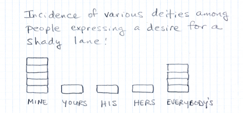
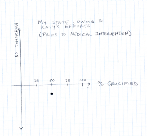
Some screechy monkey or other tagged me on the song chart meme. The idea seems to be to come up with a visual/graphical representation of a song or some lyrical subset of it.
In other words, you can get your music-geek and your math-geek on at the same time.
I came very close to going through our entire record collection last night to pick the optimal song. But then I figured I’d just put up two suboptimal responses rather than laboring to determine what the optimal response would be. (Of course, because I’m a tremendous Luddite, both are hand drawn.)
First a histogram:

After which we break out the Cartesian coordinates:

I’m tagging Julie, both Sean and Jennifer (in the hopes of a nice phase diagram or calculus-related entry), RPM, and GrrlScientist. Plus, you know, anyone else who wants to play along.

I’ve done this, and mine is on Flickr, but Flickr is blocked here (they hate photography?) so I can’t look it up. It was for Billy Joel’s piano man, and it was a chart showing people’s current profession and what they’d rather be doing.
You should have: you never know what might have fallen out of Pink Floyd.
Ooh! This is gonna take some thought… but should be fun!
This meme arrived at my doorstep recently in the context of a minor Rickroll epidemic. You know consultants–we never met a graphical representation of useless metrics that we didn’t like.
Rickroll Pie Chart
done!